The design identity of the Solidarity Fund of the UdK Berlin
The UdK Berlin Solidarity Fund for students was initiated by President Prof. Dr. Norbert Palz (President of UdK Berlin until March 31, 2025) with the support of the Strategic Marketing Unit and in collaboration with studierendenWERK Berlin during the COVID-19 pandemic. The fund aims to support students in financial distress and provide them with the opportunity to continue their studies despite unforeseen challenges.
The design was implemented with the support of the Strategic Marketing Unit.The design concept for the identity of the Solidarity Fund of the UdK Berlin is based on three essential features: (1) color (2) font and (3) form.
(1) The specific color tone generates attention, in the sense of a signal color, and at the same time appears friendly and accessible. The warm red-orange fulfills these functions.
(2) The font Edition, a clear, geometric Grotesk, which appears soft and pleasant at the same time due to its rounded edges, was created as part of Elias Hanzer's master's thesis in the class of Prof. Fons Hickmann.
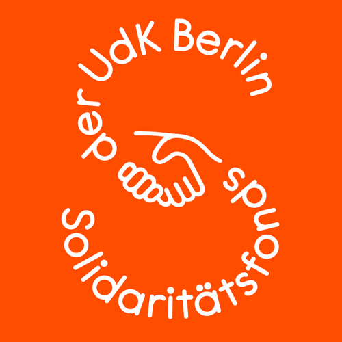
(3) The name runs along an S-shape, in the middle of which two grasping hands meet, symbolizing the assistance and supporting role of the Fund. Thus, the word sign functions both as a logotype in larger image and the plain "S" as a classic logo for use in smaller display sizes.


