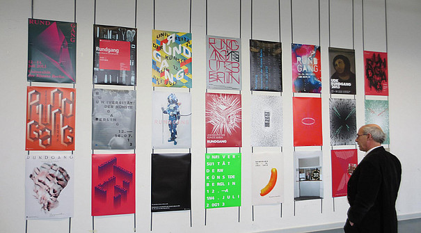
Design competition for the College of Music with the Visual Systems class
The competition
The design for the promotion of the guest performance of the UdK Berlin Symphony Orchestra in the Berlin Philharmonic Hall in May 2020 was decided in a competition and supported in an advisory capacity by the Department of Marketing and University Events.
The competition was held in the summer semester 2019 as part of the seminar Notation Laboratory in the Visual Communication / College of Architecture, Media and Design, supervised by Bernd Grether (artistic assistant in the Visual Systems class of Prof. David Skopec). The task of the seminar was to develop a graphic system for the design of an event poster, which uses techniques and elements from previously studied notation systems to visually represent the music of Gustav Mahler's Symphony No. 3, which will be performed. It was not a matter of an exact transcription of the score in the sense of a notation system, but of creating a visual composition based on musical parameters. The seminar was supported by interdisciplinary workshops in collaboration with the Experimental Music Orchestra of Marc Sabat (artistic and scientific assistant at the Institute for New Music).
In joint short-term projects, students from the Colleges of Design and Music got to know each other at the acoustic/visual interface and new synergies were created.
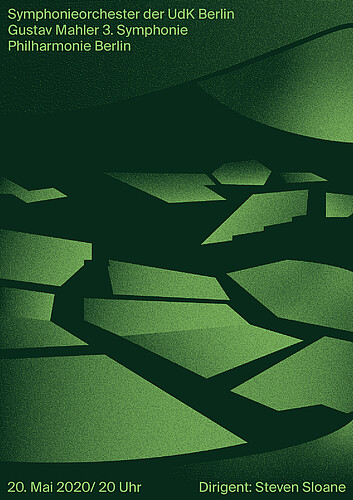
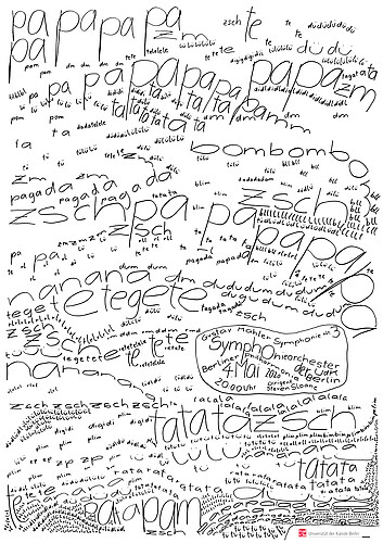
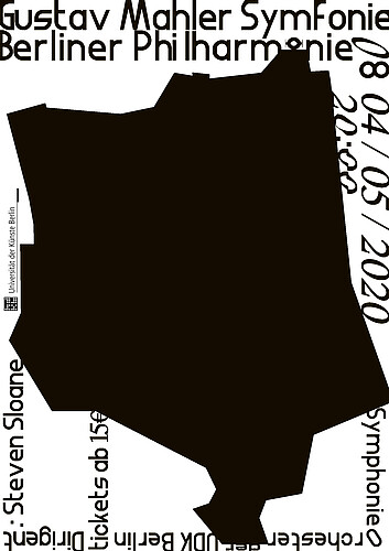
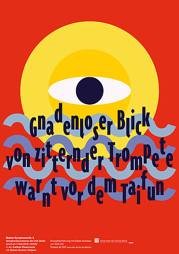
Winner: Leander Limburg
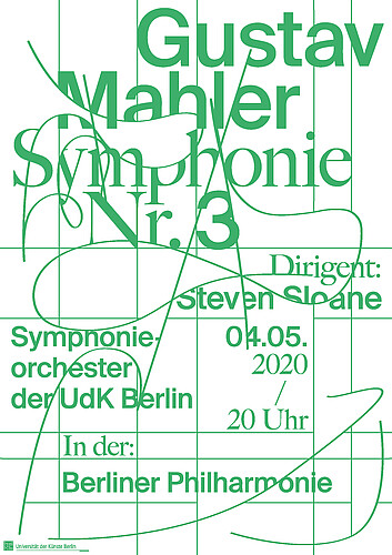
The poster series illustrates the structure, instrumentation and metrics of the symphonys in an abstract way, by which the poster becomes a map of the music, showing it's complexity.
source: Leander Limburg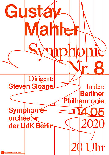
The poster series illustrates the structure, instrumentation and metrics of the symphonys in an abstract way, by which the poster becomes a map of the music, showing it's complexity.
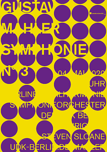
source: Leander LimburgCommunication media, developed from the winning design

offline communication: poster
source: Leander Limburg, UdK Berlin Marketing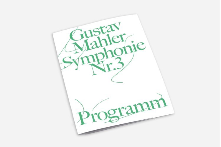
offline communication: programme
source: Leander Limburg, UdK Berlin Marketing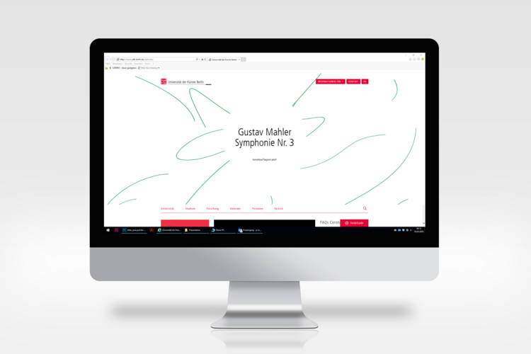
online communication: UdK Berlin landing page
source: Leander Limburg, UdK Berlin Marketing
online communication: UdK Berlin website
source: Leander Limburg, UdK Berlin Marketing
online communication: UdK Berlin website mobile
source: Leander Lumburg, UdK Berlin Marketing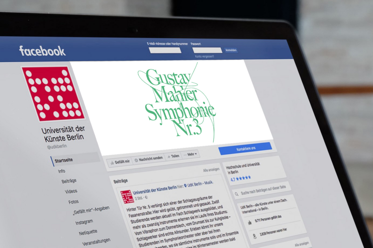
online communication: Facebook
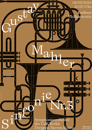
source: Leander Limburg, UdK Berlin MarketingAdam Behlen
This design refers to elements of the architecture of the Berlin Philharmonie building by Hans Scharoun.
source: Adam Behlen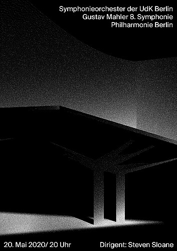
This design refers to elements of the architecture of the Berlin Philharmonie building by Hans Scharoun.
source: Adam BehlenAgnieszka Doczyńska
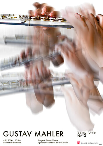
The very beggining of music is the moment when hands touch the instrument. After that, they guide the rythm, sounds and shape the piece using specific gestures. Every piece of music has its own, unique movement, that creates dynamics and sounds.
source: Agnieszka Doczyńska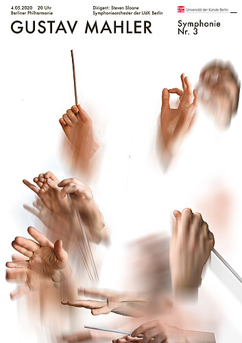
The very beggining of music is the moment when hands touch the instrument. After that, they guide the rythm, sounds and shape the piece using specific gestures. Every piece of music has its own, unique movement, that creates dynamics and sounds.
source: Agnieszka DoczyńskaAnaïs Nyffeler
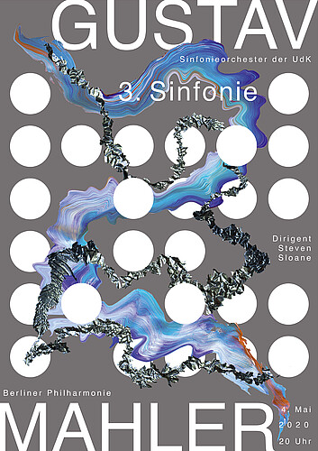
An interpretation and visualisation of Gustav Mahler’s third and eighth symphony in a grid, which represents the logo of the University of Arts Berlin.
source: Anaïs Nyffeler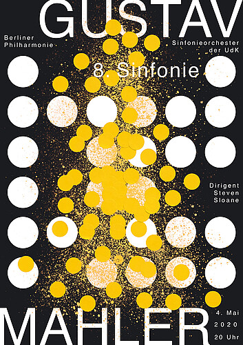
An interpretation and visualisation of Gustav Mahler’s third and eighth symphony in a grid, which represents the logo of the University of Arts Berlin.
source: Anaïs NyffelerEva-Maria Schitter
In this design the whole symphony is written down. The designer used onomatopoetic words to capture expression, tempo and volume whilst listening to the music.
source: Eva-Marie Schitter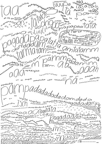
In this design the whole symphony is written down. The designer used onomatopoetic words to capture expression, tempo and volume whilst listening to the music.
source: Eva-Maria SchitterXiwen Zhang
In this design, the silhouette of the Berliner Philharmonie’s floor plan is used as the main element and the information surrounds it becomes malleable; they either stretch, reorient, or become a different font structure. The main element of the floor plan always stays the same throughout, while everything else surrounds it liquifies.
source: Xiwen Zhang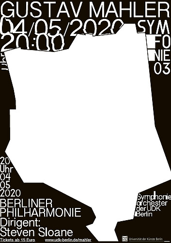
In this design, the silhouette of the Berliner Philharmonie’s floor plan is used as the main element and the information surrounds it becomes malleable; they either stretch, reorient, or become a different font structure. The main element of the floor plan always stays the same throughout, while everything else surrounds it liquifies.
source: Xiwen ZhangJohanna Philipp
Haikus are a wonderful way to capture moments of beauty, touching experiences and elusive moments. Because of that my series consists of a short poem that describes the beginning of each symphony and in addition an illustration that translates the haiku into something pictorial.
source: Johanna Philipp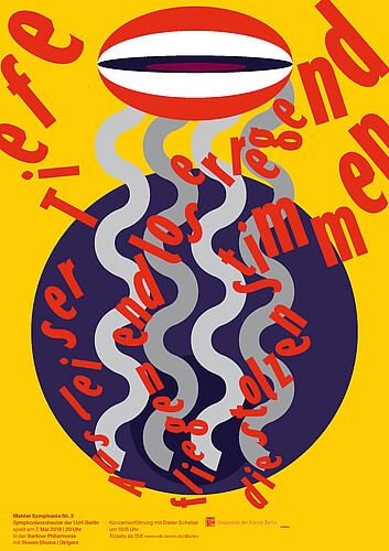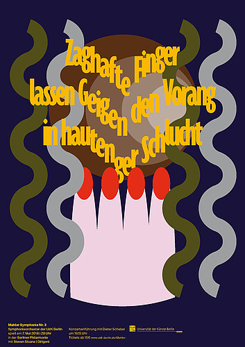
Haikus are a wonderful way to capture moments of beauty, touching experiences and elusive moments. Because of that my series consists of a short poem that describes the beginning of each symphony and in addition an illustration that translates the haiku into something pictorial.
source: Johanna PhilippJohannes Schmoll
The concept for the posters is based on a series of observations: Music is something that is perceived as a whole, but is composed of many individual parts. Music is something playful. Music is something technical. And music is something that grows out of the interaction of multiple participants.
source: Johannes Schmoll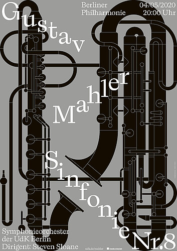
The concept for the posters is based on a series of observations: Music is something that is perceived as a whole, but is composed of many individual parts. Music is something playful. Music is something technical. And music is something that grows out of the interaction of multiple participants.
source: Johannes SchmollJulia Arens
Each individual form of the design translates into one of the movements of the symphony. The shapes are created through a technical visualization of the audio track of the Mahler piece. The patterns represent the mood and ambience of each movement which leads to interpreting the whole form as the visual translation of the symphony.
source: Julia Arens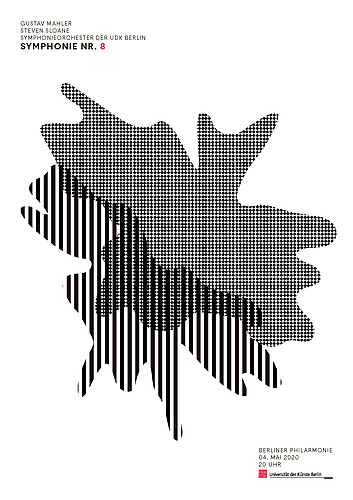
Each individual form of the design translates into one of the movements of the symphony. The shapes are created through a technical visualization of the audio track of the Mahler piece. The patterns represent the mood and ambience of each movement which leads to interpreting the whole form as the visual translation of the symphony.
source: Julia ArensMarlon Nicolaisen
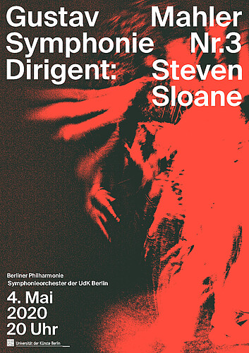
Mahler manages to trigger emotions and feelings in the audience. With the help of a dancer, the photograph tries to illustrate and capture them. The performing dancer hears Mahler's piece for the first time and thus intuitively translates Mahler's world.
source: Marlon Nicolaisen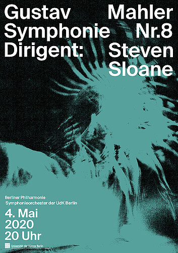
Mahler manages to trigger emotions and feelings in the audience. With the help of a dancer, the photograph tries to illustrate and capture them. The performing dancer hears Mahler's piece for the first time and thus intuitively translates Mahler's world.
source: Marlon NicolaisenNiklas Thran
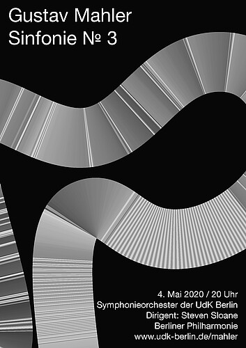
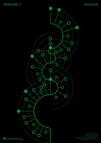
The idea is about finding a way to visually translate Mahler’s third and eighths symphony via digitally processing the notations of his scores. The result is a greyscale image of vertical lines, horizontally stacked. The brightness value of each element displays a single note’s pitch throughout the composition. To signify the variety of his pieces, the alignment was set along a bow-like construct, similar to a curvy road – seen from an aerial perspective – winding through the mountain range of Mahler’s musical universe.
source: Niklas Thran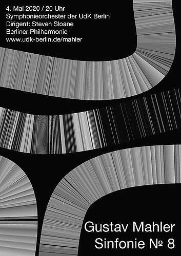
The idea is about finding a way to visually translate Mahler’s third and eighths symphony via digitally processing the notations of his scores. The result is a greyscale image of vertical lines, horizontally stacked. The brightness value of each element displays a single note’s pitch throughout the composition. To signify the variety of his pieces, the alignment was set along a bow-like construct, similar to a curvy road – seen from an aerial perspective – winding through the mountain range of Mahler’s musical universe.
source: Niklas ThranPaul Jochum
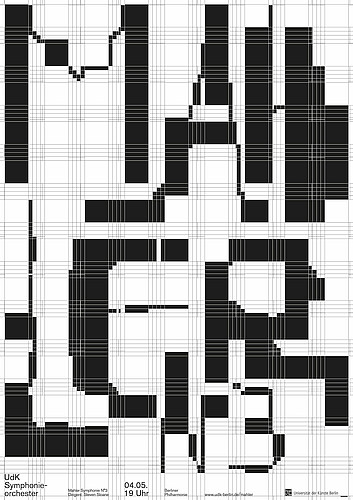
Music works in time and lives of breaks and pauses. In this design, the rhythm of the words is highlighted and the resulting composition has a score-like visual quality. With this poster design, Paul Jochum is among the winners of the 100 best posters in 2019.
source: Paul Jochum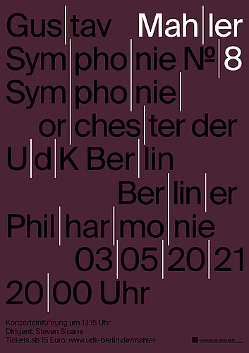
Music works in time and lives of breaks and pauses. In this design, the rhythm of the words is highlighted and the resulting composition has a score-like visual quality. With this poster design, Paul Jochum is among the winners of the 100 best posters in 2019.
source: Paul Jochum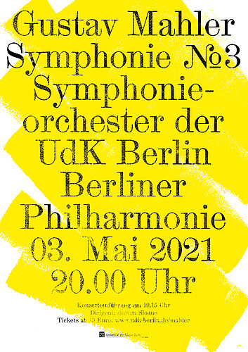
In this alternative design the idea is a simple play on words „Maler” means painter in German.
source: Paul Jochum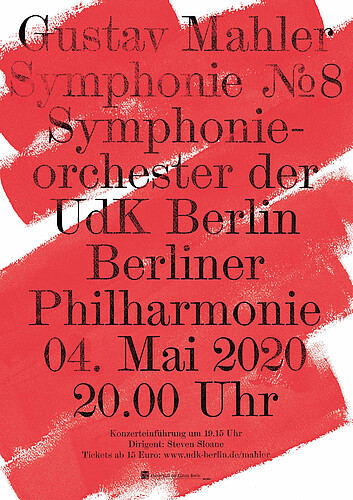
In this alternative design the idea is a simple play on words „Maler” means painter in German.
source: Paul JochumSandra Pizzorno
Classical music makes plants grow better, it is said. In this poster a graphical plant, generated following a strict algorithmic process, gives a visual representation to the symphony it invites us to listen to.
source: Sandra Pizzorno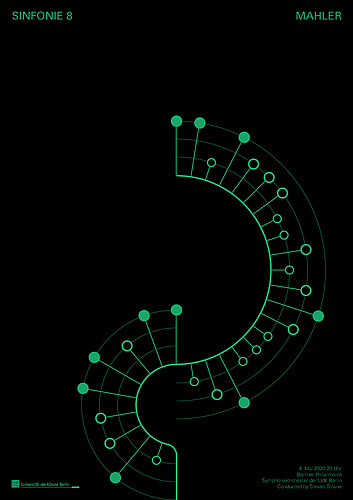
Classical music makes plants grow better, it is said. In this poster a graphical plant, generated following a strict algorithmic process, gives a visual representation to the symphony it invites us to listen to.
source: Sandra PizzornoWinona Bogner
The first six scores of a music piece build the base of the poster. The striking colors underlie the complementary color contrast of Johannes Ittens color wheel. The font becomes part of the whole design, therefore the viewer becomes motivated to have a closer look at the poster and to look into it.
source: Winona Bogner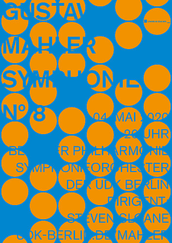
The first six scores of a music piece build the base of the poster. The striking colors underlie the complementary color contrast of Johannes Ittens color wheel. The font becomes part of the whole design, therefore the viewer becomes motivated to have a closer look at the poster and to look into it.
source: Winona BognerCécile Vexler
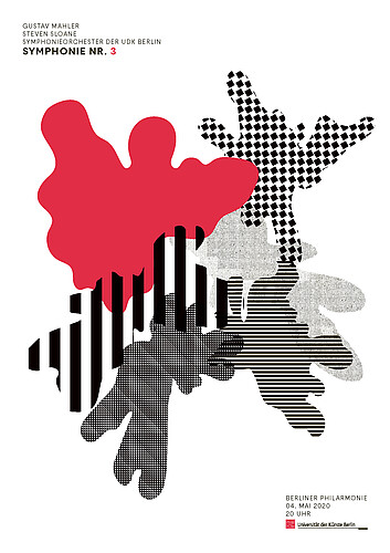
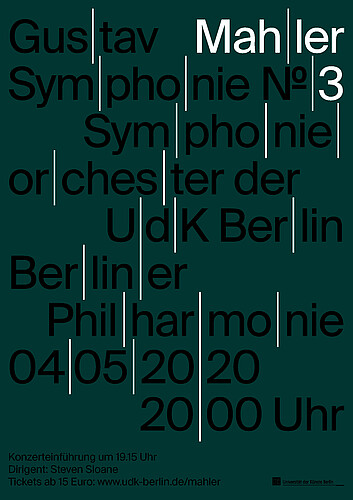
The poster series was designed with a grid, which refers to the line system of music scores. This results from placing the usual horizontal lines vertically to it.
source: Cécile Vexler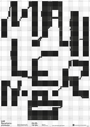
The poster series was designed with a grid, which refers to the line system of music scores. This results from placing the usual horizontal lines vertically to it.
source: Cécile Vexler